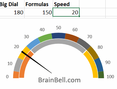
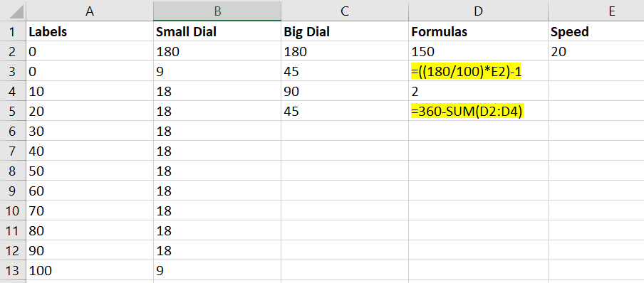
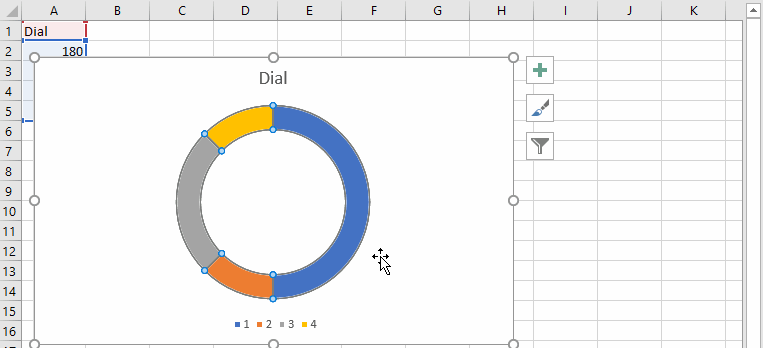
First, set up some data as shown in the figure:
CTRL+` to show the actual formulas (highlighted) on the worksheet.Next, create a doughnut chart as shown in the figure. A doughnut chart works a bit like pie chart, but it can contain multiple series, whereas a pie chart cannot:
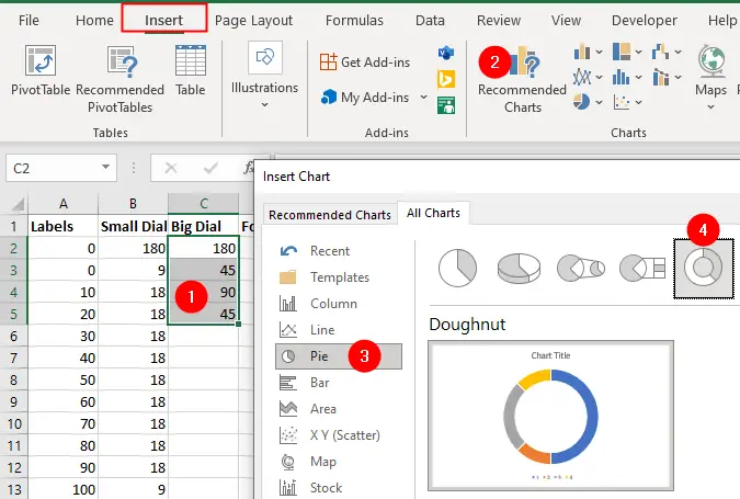
- Highlight the range
C2:C5 - Go to the
Inserttab and click theRecommended Chartsicon in Charts group. The Insert Chart dialog box will be displayed. - Choose
Piefrom theAll Chartstab. - Select the doughnut as shown in the above figure.
- Click OK button to insert the chart on the worksheet.
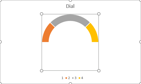
Select the doughnut chart, slowly double-click the largest slice to select it, and then right-click on the selected slice and choose Format Data Point from the context menu. It will shows the Format Data Point pane on the right side of the workbook:
Click the Series Options from the Format Data Point pane and set the angle of this slice to 90 degrees.
Then click the Fill & Line icon and select the No fill and No line from the Fill and Border options as shown in the above animation.
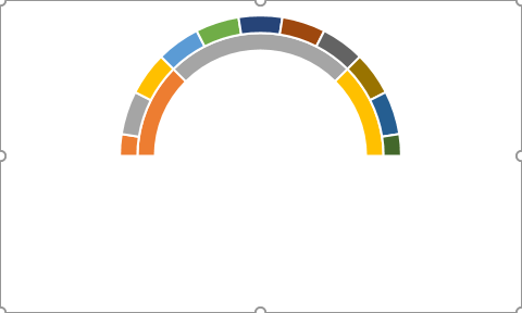
The doughnut chart should look like the one in the figure below:
You need to add another series (Series 2) of values to form the slots for the small dial chunks. So again highlight the chart, and delete legends and chart title, then follow these steps:
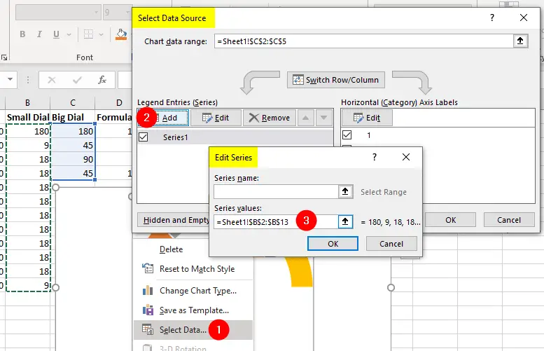
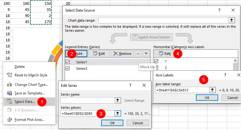
- Right-click on the chart and select
Select Dataoption. The Select Data Source dialog box appears. - Click the
Addbutton from the Legend Entries (Series) tab. , which will opens the Edit Series dialog box. - Under the
Series Valuesbox, select the rangeB2:B13. Click the OK button.
Click OK again to close the Select Data Source dialog box.
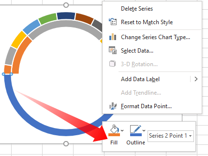
Again, slowly double-click the largest slice, Point 1, of Series 2 to select it, and then right-click on the selected slice and set the fill and border to No fill and No line from the shortcut menu as shown in the above figure.
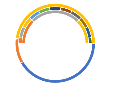
The doughnut chart should look like the one in the figure below:
Add another series (Series 3) of values to form the slots for the dial labels:
- Right-click on the chart and select
Select Dataoption. - Click the
Addbutton to add a third series (Series 3) to create the needle. - Under the
Series Values, select the rangeD2:D5. Press OK button to return back to the Select Data Source dialog box. - Click
Editbutton on right tab Horizontal (Category) Axis Labels. - Under the
Axis label range, select the rangeA2:A13and click OK.
The doughnut chart should look like the one in the figure below:
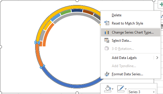
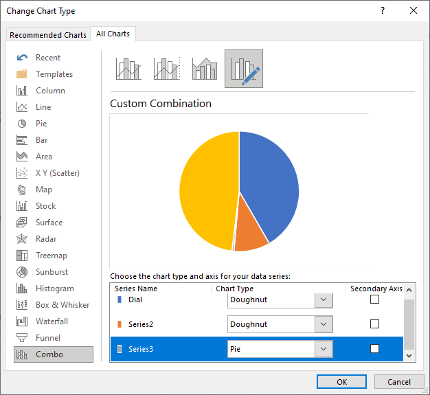
Highlight Series 3 (outer series), then right-click it and select Change Series Chart Type:
Change this series to the default pie chart. Yes, it looks strange. But rest assured, if the pie chart overlays the doughnut chart, you have done this correctly. See following figure:
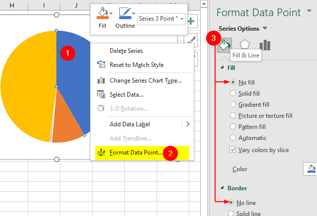
Next you need to hide all the slices of pie chart you just laid over the doughnut except the smaller one.
- Select one section of the pie chart (two slow clicks on the desired slice will do this)
- Right-click on it and choose
Format Data Pointfrom the context menu. This will open the Format Data Point pane on the right side of workbook. - Click
Fill & Lineand selectNo fillfrom the Fill section andNo linefrom the Border section.
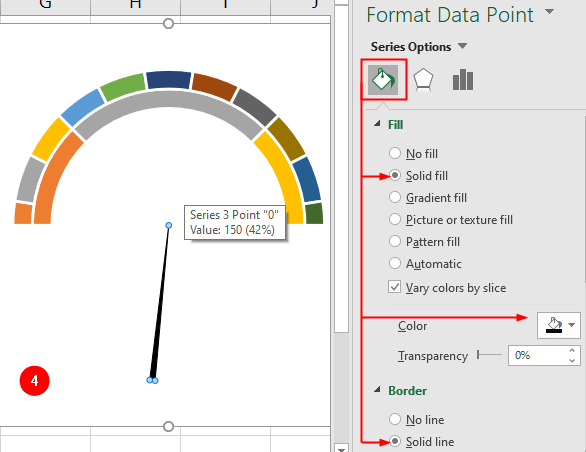
No fill and No line options from the Format Data Point pane.- Next, select the smallest slice and format it as shown in the following figure:
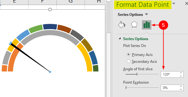
- While the smallest pie slice selected, choose Series Options icon from the Format Data Point pane and change the “Angle of the first slice” to
120degrees:
- Next insert data labels: select the chart, go to the
Chart Designtab, clickAdd Chart Elementdrop-down and selectData Labelsand then chooseData Callout:
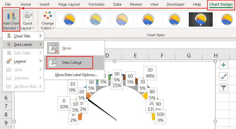
- Right-click on a data label and choose
Series 1 Data Labelsto select them, then press the Delete button on the keyboard to delete them.
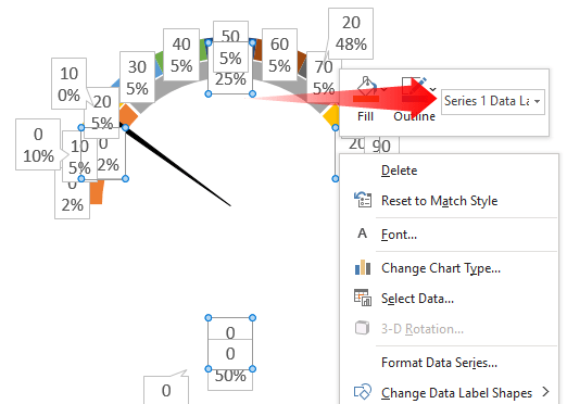
Repeat the above step (step 7) to remove the Series 3 Data Labels.
- Now you will only have Series 2 data labels on the chart. Slowly double-click on the bottom data label (showing 0 and 50%) and delete it.
- Click outside of the chart to de-select it, then right-click one of the label it will select all labels, choose
Format Data Labelsfrom he context menu. - Uncheck the
Percentagebox from the Format Data Labels pane. See following figure:
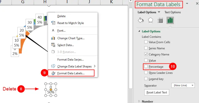
- Next, select
No FillandNo Linefrom theFill & Linesection:
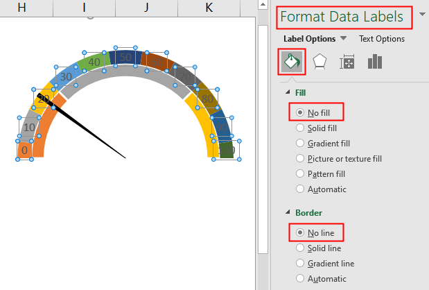
Finally, adjust the position of labels as shown in the following animation:
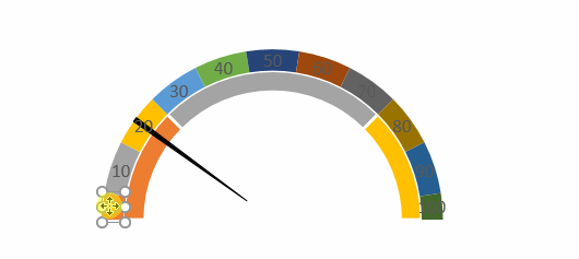
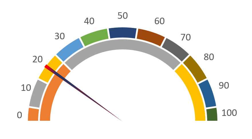
The final result: