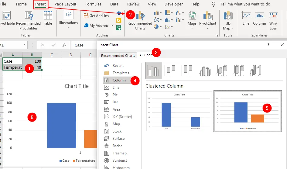
Set up some data, such as that shown in the figure, and create a basic clustered column chart, charting the data in rows. We used the range A1:B2.
Remove the chart title, legend and the category axis (click them to highlight them, then press Delete).
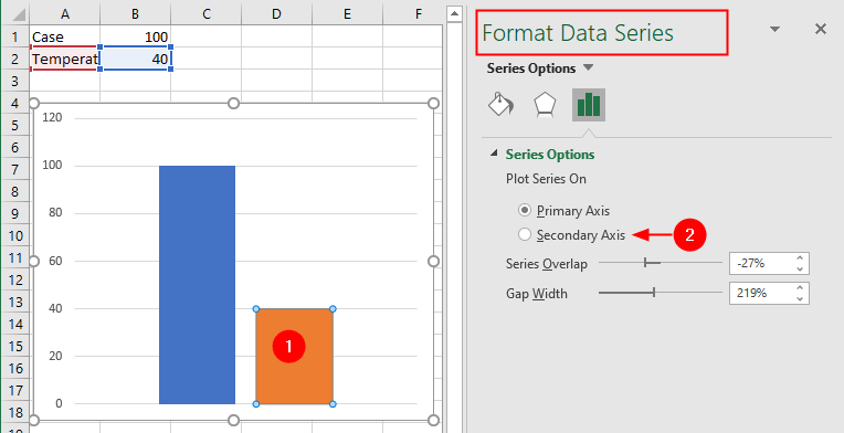
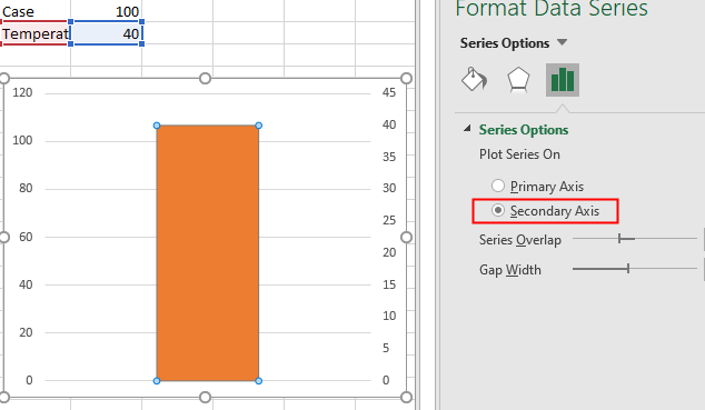
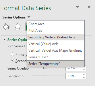
Click on the Temperature series to select it, then select the Secondary Axis option from the Format Data Series pane, resulting in the chart in the figure:
While the chart (or the data series) selected, go to the “Format Data Series” pane, click Series Options drop-down and select the Secondary Vertical (Values) Axis option from the menu:
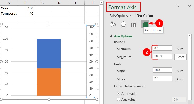
Selecting the Secondary Vertical (Values) Axis option will open the “Format Axis” pane.
Click Axis Options icon, set the Minimum to 0, the Maximum to 100, the Major Unit to 10, and the Minor Unit to 2. You’ll see the chart shown in the figure:
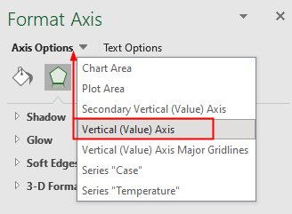
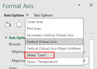
Next, select the Vertical (Values) Axis option from the Axis Options menu:
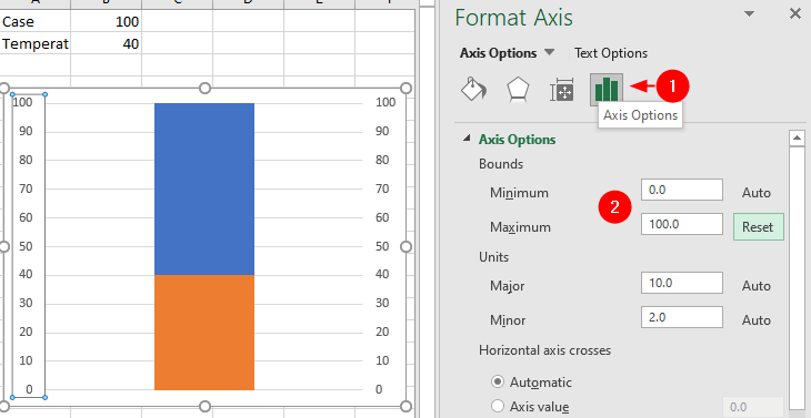
Repeat the same steps you did for the Secondary Vertical (Values) Axis option. You’ll see the chart shown in the figure:
Select the Series "Case" from Axis Options drop-down:
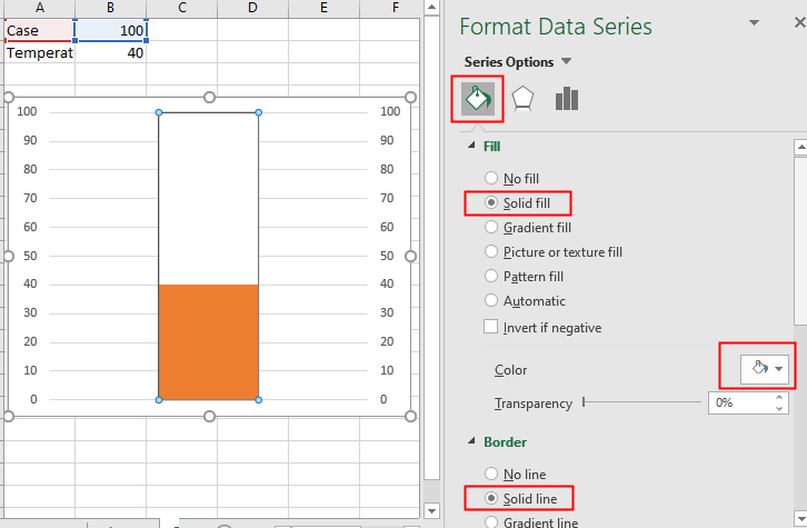
Select Fill & Line icon, choose Solid fill to White and Solid line to black:
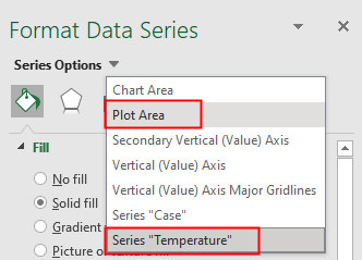
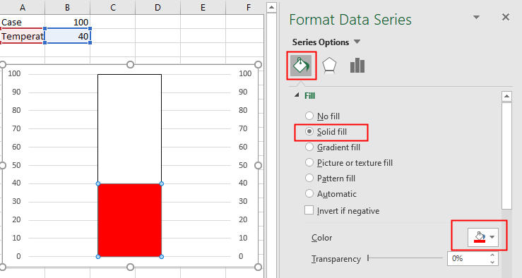
Next, select the Series "Temperature" from the Series Options drop-down and format the Temperature series to Red.
Then select the Plot Area from the menu and format it to white.
At this point, the thermometer chart should be taking shape:
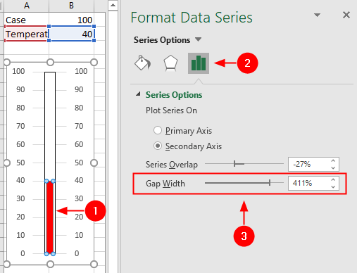
Finally, reduce the width of the chart. Adjust the Gap Width property for the Temperature series by clicking on it and then selecting the Series Options from the Format Data Series pane.
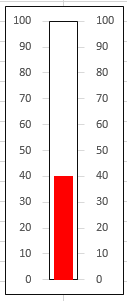
As the figure demonstrates, by fiddling around a bit with Excel’s existing chart features, you can come up with a thermometer chart that looks great and works well.