Widget
Button
Represents a push-button widget that registers when the screen is touched within its bounds.
ToggleButton
Displays checked/unchecked (or on/off) states using a light indicator.
CheckBox
A special type of button with a check mark graphic and description text that has two states: checked or unchecked.
RadioButton
The RadioButton has two states: either checked or unchecked. A RadioGroup is used to group one or more RadioButton views, thereby allowing only one RadioButton to be checked within the RadioGroup.
CheckedTextView
This is basically a TextView that can be checked and is sometimes used in a ListView.
Spinner
A drop-down menu is called spinner. The SpinnerView displays one item at a time from a list and enables users to choose from them.
ProgressBar
ProgressBar (Horizontal)
The ProgressBar provides visual feedback about some ongoing tasks, such as when you are performing a task in the background. For example, you might be uploading or downloading a file from the web and need to update the user about the status of the upload or download. In this case, the ProgressBar view is a good choice.
SeekBar
SeekBar is a user-modifiable ProgressBar. It allows the user to choose a value along a continuous range by sliding a "thumb" along a horizontal line. For example, to set the current cursor position in a playing media file or to tweak a volume setting.
SeekBar (Discrete)
It is just a theme to show the tickbar in SeekBar.
QuickContactBadge
This view allows you to easily display a contact that can handle various actions when tapped (such as email, text, call, and so on).
RatingBar
The RatingBar show ratings or getting a rating from a user. By default, this progress bar uses the star paradigm, with five stars by default. A user can drag across this horizontal to set a rating.
Switch
The Switch has two possible states that can be read and responded to. An obvious use for the Switch widget would be to show and hide something.
Space
This is a very simple class, the sole purpose of which is to create gaps within layouts.
Text
Contains predefined text views for different types of text inputs such as label (TextView), password, date, time, number, and e-mail.
TextView
The TextView is used to display text to the users and this text information can't be edited by the users. This is the most basic view and one that you will frequently use when you develop Android applications.
EditText
Note: The
Plain Text,Password,Password (Numeric),Phone,Postal Address,Multiline Text,Time,Date,Number,Number (Signed)andNumber (Decimal)all areEditTextwidgets.
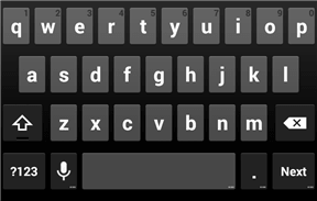
The EditText is used to get text input from users. By default, when the user taps the EditText field, such as Plain Text, the standard keyboard appears and they can enter whatever characters they like. However, you may want to restrict the kind of data users can enter into the EditText fields by changing the inputType attribute in Attributes pane.
This restriction prevents the user from entering invalid data, but also display the optimized keyboard for a particular kind of content. For example, if you specify that the EditText inputType value is a phone number the Android system will display the numerical keyboard, which makes it easier for the user to input the required data.
Following are the pre-built EditText views available in Palette pane:
Plain Text
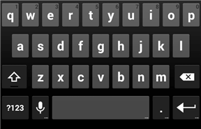
Shows the standard text keyboard.
Password
Shows the standard text keyboard and masks the the text that is entered for privacy.
Password (Numeric)
Shows a numeric keyboard and masks the the text that is entered for privacy.
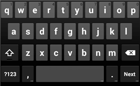
Shows the standard text keyboard with the addition of the @ character.
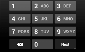
Phone
Shows the phone-style keyboard.
Postal Address
Shows the standard text keyboard.
Multiline Text
Shows the standard text keyboard with the addition of the Enter key for adding new line.
Time
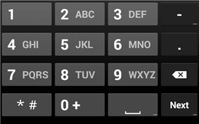
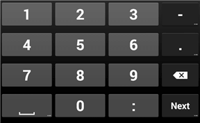
Shows the numeric keyboard with the addition of the : character.
Date
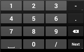
Shows the numeric keyboard with the addition of the / character.
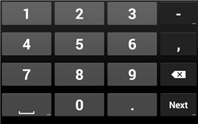
Number
Shows the basic numeric keyboard.
Number (Signed)
Shows the basic numeric keyboard. Allows a + or - character at the start.
Number (Decimal)
Shows the basic numeric keyboard. Allows a decimal point . to provide fractional values.
AutoCompleteTextView
The AutoCompleteTextView is a subclass of EditText, it automatically shows a list of completion suggestions while the user is typing.
MultiAutoCompleteTextView
There are two forms of autocomplete. One is the more standard style of filling in the entire text entry based on what the user types. If the user begins typing a string that matches a word in a list, the user can choose to complete the word with just a tap. This is done through the AutoCompleteTextView control.
The second method allows the user to enter a list of items, each of which has autocomplete functionality. These items must be separated in some way by providing a separator (i.e. comma) to the MultiAutoCompleteTextView object that handles this method.
Layouts
ConstraintLayout
In 2016, Google introduced ConstraintLayout as an alternative to LinearLayout and RelativeLayout. ConstraintLayout requires to use a library and it adds approximately 100KB to the size of your Android app.
GridLayout
In 2011, Google added GridLayout to setting up complex Android layouts a bit easier. As the name suggests, this class allows child views to be arranged in a grid layout.
The GridLayout class is optimized specifically for creating grid UI design using a minimal amount of system memory, and can render both horizontal UI element and vertical UI element alignment at the same time in the same UI.
FrameLayout
The FrameLayout layout is a placeholder on screen that you can use to display a single view. If multiple child views are added they will, by default, appear on top of each other positioned in the top left hand corner of the layout area.
LinearLayout (Horizontal)
LinearLayout (Vertical)
LinearLayout(Horizontal) and LinearLayout(Vertical) are actually the same layout with one property changed. The LinearLayout arranges views in a single column or a single row depending on the orientation selected.
RelativeLayout
The RelativeLayout layout enables you to specify how child views are positioned relative to each other. Each view embedded within the RelativeLayout has attributes that enable it to align with another view.
TableLayout
The TableLayout Layout groups views into rows and columns. You use the <TableRow> element to designate a row in the table. Each row can contain one or more views. Each view you place within a row forms a cell. The width of each column is determined by the largest width of each cell in that column.
TableRow
The purpose of the TableLayout container view is to allow user interface elements to be organized on the screen in a table format consisting of rows and columns. Each row within a TableLayout is occupied by a TableRow instance, which, in turn, is divided into cells, with each cell containing a single child view (which may itself be a container with multiple view children).
<fragment>
A fragment is a self-contained, modular section of your app's user interface that you embed inside an activity. You cannot instantiate a fragment as a standalone application element. Think of a fragment as a kind of sub activity that has its own life cycle, behavior, and its own user interface. When you drag <fragment> from the palette, the Android Studio shows a Classes dialog box which holds the available fragments classes:
DialogFragment
Floats on top of an activity, useful when you need to obtain the user's response before continuing with execution.ListFragment
Contains a ListView which displays a list of items from a data source.PreferenceFragment
Provide preferences for users to personalize the application.WebViewFragment
Hosts a WebView control to easily render Web content.
Containers
RadioGroup
Multiple radio buttons can be grouped together into a RadioGroup, which allows only one radio button of the group to be selected at a time.
ListView
To display a list of items, Android provides ListView and Spinner. The ListView displays a long list of items in a vertically scrolling list.
GridView
The GridView shows items in a two-dimensional scrolling grid. You can use the GridView together with an ImageView to display a series of images.
ExpandableListView
ExpandableListView is a subclass of ListView, that supports a two-level list hierarchy: lists and sub-lists. ExpandableListActivity allows an item within a list to expand and present a sub-list of items.
ScrollView
A ScrollView is a special type of FrameLayout in that it enables users to scroll through a list of views that occupy more space than the physical display. The ScrollView can contain only one child view or ViewGroup, which normally is a LinearLayout.
HorizontalScrollView
Android also has HorizontalScrollView, which works like ScrollView... just horizontally.
TabHost
A TabHost is a container for a tabbed window view, where each tab can contain a View (such as a layout / container) and the user selects a tab to see its contents.
Note: A tabbed window consists of a
TabActivity (deprecated)and aTabHost. In most cases using tabs in the app bar (or action bar) would be preferable.
WebView
The WebView enables you to embed a web browser in your activity. This is very useful if your application needs to embed some web content, such as maps from some other providers, and so on. The following Try It Out shows how you can programmatically load the content of a web page and display it in your activity.
SearchView
In Android 3.0, Google introduced the SearchView, which can be included as a menu item when creating a menu. With this view, an expandable search area can easily be added to the app bar (action bar).
ViewPager
The ViewPager helps developers to design a multi-panel side-to-side swipeable horizontal UI that allows users to flip between different View objects. Later, you'll learn, how to create a slideshow using the ViewPager.
Images
ImageButton
Works similar to the Button view, except that it also displays an image. The ImageButton class is a subclass of the ImageView class.
ImageView
The ImageView is a view that shows images on the device screen.
VideoView
VideoView helps you to display videos on the device screen. The VideoView class has a wide range of methods to manage the playback of video.
Date
TimePicker
The TimePicker view enables users to select a time of the day, in either 24-hour mode or AM/PM mode.
DatePicker
Using the DatePicker view widget, users can select any date conveniently from the activity.
CalendarView
This view, added in API Level 11, lets you easily display dates to users and allow them to select dates.
Chronometer
This view inherits from TextView and encapsulates the functionality of a running clock. For example, denoting elapsed time of some operation.
TextClock
This view, added in API Level 17, is a compact text display of the current time in standard numeric format. It is a TextView, allows you to format the display of the date and/or time. In addition, the TextClock allows you to display the time in 12-hour mode or 24-hour mode and even allows you to set the time zone.
Transitions
ImageSwitcher
We use ImageView to display an image. However, sometimes we don't want an image to appear abruptly when the user opens the view. For example, we might want to apply some animation to an image when it transitions from one image to another. In this case, we need to use the ImageSwitcher.
AdapterViewFlipper
AdapterViewFlipper works like a ViewFlipper, allowing you to toggle between various children with only one visible at a time. However, whereas with ViewFlipper all children are fully-instantiated View objects held by the ViewFlipper parent, AdapterViewFlipper uses the Adapter model, so only a small number of actual View objects are held in memory, no matter how many potential children there are.
StackView
StackView is an AdapterView. It was added in API Level 11 to provide a "stack of cards" UI. Just as ListView shows a handful of rows, StackView shows a handful of swipeable cards.
TextSwitcher
Switches between two TextViews. This is really just a ViewSwitcher with a few helper methods.
ViewAnimator
Base class for a FrameLayout, switches among views, using an animation.
ViewFlipper
Simple ViewAnimator that will animate between two or more views that have been added to it. Only one child is shown at a time. If requested, can automatically flip between each child at a regular interval.
ViewSwitcher
Another ViewAnimator that contains only two child views and only one of those is shown at a time. It switches between the two, animating as it does so. Primarily, the ImageSwitcher and TextSwitcher objects are used.
Advanced
<include>
Allows you to encapsulate a widget or a collection of widgets that you want to reuse across multiple layout XML resources. Simply create a dedicated layout XML resource that contains the widgets to reuse, then add them to your main layouts via an <include>.
<requestFocus>
You can give a widget focus via requestFocus. For example, a Button has a <requestFocus> child element, indicating to Android that this widget should get the focus first when display the launcher activity.
<view>
It is the basic building block for user interface. A view occupies a rectangular area on the screen and is responsible for drawing and event handling. A view is used for drawing a shape like circle, rectangle, or ovals etc.
ViewStub
Allows you to add views to a layout during runtime as they are needed, rather than building them directly into your layouts.
TextureView
Introduced in API level 14. TextureView is used for displaying hardware-accelerated content streams such as video or OpenGL. The TextureView is similar to the SurfaceView but carries the distinction of being tied directly to hardware acceleration.
SurfaceView
The SurfaceView is used when rendering custom visuals to the screen, primarily for content that is frequently changing. Basic or simple games can use SurfaceView to display the graphics with efficiency.
NumberPicker
It is very similar to the TimePicker. NumberPicker allow users to choose a number from a pre-defined range.
AdView
The View to display banner ads.
MapView
Displays a location with Google Maps.
Design
CoordinatorLayout
CoordinatorLayout is a subclass of FrameLayout, designed specifically for coordinating the appearance and behavior of the app bar (action bar) across the top of an application screen with other view elements.
AppBarLayout
App Bar displays the title for the activity on one side and an overflow menu on the other. AppBarLayout is a vertical LinearLayout which implements many of the features of material designs app bar concept, namely scrolling gestures.
TabLayout
TabLayout provides a horizontal layout to display tabs.
TabItem
Allows you to add items to Tablayout
NestedScrollView
It is just like ScrollView, but it supports acting as both a nested scrolling parent and child on both new and old versions of Android.
FloatingActionButton
Floating action button, or FAB, is round button, usually floating towards the bottom of the screen over top of the main UI.
TextInputLayout
It is a way of implementing the floating label pattern. It is a ViewGroup, wrapped around the EditText that provides the floating label pattern. For example, it is useful to show hint or error if the user enters the invalid value.
AppCompat
AppCompat is a support library that emulates many of the features of later versions of Android on earlier versions. Using the support library provides the greatest device compatibility as it allows the use of latest features on older versions of the Android OS. For example, a navigation drawer view, floating labels for EditText, floating action button (FAB), snackbar, CoordinatorLayout and AppBarLayout, the Toolbar instead of the Action Bar, the RecyclerView instead of the ListView, etc.
CardView
A FrameLayout with rounded corner card-like appearance. It is one of the most recognizable material design components.
GridLayout
As the name suggests, this class allows child views to be arranged in a grid layout.
RecyclerView
In 2014, Google released RecyclerView. It is much like the ListView class, the purpose of the RecyclerView is to allow information to be presented to the user in the form of a scrollable list. The RecyclerView, however, provides a number of advantages over the ListView. The RecyclerView and CardView work together to provide scrollable lists of information to the user in which the information is presented in the form of individual cards.
Toolbar
Android applications have always contained a toolbar at the top of the screen. Formerly it was called the action bar. It was used to provide a title and top level menu.

Toolbar on GMail app.
Android 5.0 (API level 21) introduced a Toolbar widget (app bar), offering functionality of action bar, but in the form of a ViewGroup that can be positioned where you need it. The app bar allows us to set its color, place it anywhere on the screen, and include a wider range of content than its predecessor.