Fonts have traditionally been broken down into groups, referred to as font categories or, as in CSS, font families. Fonts are grouped based on like characteristics. In CSS, there are five general categories:
-
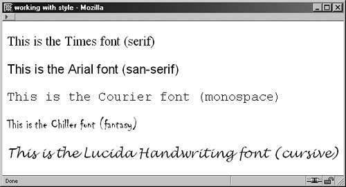
Serif A serif font is one that has flourishes on the letter, referred to as, you guessed it, serifs. These fonts are thought to be excellent for body text, especially in print, and are very suitable for header and other text such as captions. Serif fonts that might be familiar to you include Times and Georgia, both of which are widely used on the Web.
-
Sans-serif The term sans-serif means "without serif" and describes, quite literally, fonts that have no flourishes. Instead, sans-serif fonts tend to have rounded, wider letters. Typically thought to be best for headers in print, they are anecdotally thought by many to be the better choice for body text onscreen. They aren't always the best choice for very small text or for italicized text, however. Familiar fonts within this category include Arial, Helvetica, and Verdana.
-
Monospace Monospace fonts are fonts whose letters are all the same width. They are typically used to describe programming code samples. In recent years, they've been popular in design, giving a very "grunge" look to the designs in which they are used. However, you'll typically limit use of monospace fonts to code samples. The most common monospace font in computing is Courier.
-
Fantasy Fantasy fonts, also known as decorative fonts, are fonts with unusual features. They tend to be elaborate and useful for headers or small areas of text, and not very useful for body text because their decorations make them difficult to read. You will rarely, if ever, use a fantasy font in CSS because they are very numerous and are not found with any consistency on most computers. An example is the Western font.
-
Cursive Cursive fonts are also referred to as handwriting fonts. They mimic cursive handwriting and are often filled with flourishes. As with fantasy fonts, cursive fonts are rarely applied with CSS. Many designers set fantasy or cursive fonts on graphics and use them as decorative typographic elements within a design. A common cursive font is Lucida Handwriting (see Figure 9-1).
Figure 9-1. I used inline CSS to style each line of text with the font specified.
Fonts that are common to almost everyone's system these days include Arial, Helvetica, Verdana, Times, Georgia, and Courier. Tahoma, Trebuchet, and Lucida fonts are fairly widespread because they ship with all Windows versions and were originally included in Microsoft's Web Font Pack, a free set of fonts that Microsoft distributed in the relatively early days of the Web.
If you're just starting out, it's best to stick to a very simple scheme with fonts. You can do one of the following:
-
Choose one font, a common serif or sans-serif, and use that same font for everything. Modify size, weight, color and other styles to gain interest.
-
Choose two fonts, a common serif and a common sans-serif. Use the serif for all headings, captions, and other text; use the sans-serif for body text. (This option is very common on the Web.)
-
Choose two fonts, a common sans-serif and a common serif. Use the sans-serif for all headings, captions, and other text; use the serif for body text. (Also a common option for the Web, this technique has long been used in the print world; look at any newspaper or book, and you're likely to see this combination in use.)
As you become more adept at using fonts, you might want to get more creative, but, typically, sticking to one of these options will make your documents look more professional and consistent.