Absolute and Relative Keywords
Absolute keywords size fonts based on the way that the browser computes their size. The keywords available are xx-small, x-small, small, medium, large, x-large, and xx-large. Here, I've applied an absolute keyword to paragraph text:
p {font-size: medium;}
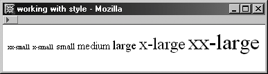
The medium size is typically equivalent to the browser's default size for that element. Figure shows all the keywords as applied to default browser text.
Absolute keyword sizing within a web browser.
Where absolute keywords are dependent upon the browser's computation of fonts, the relative keywords of larger and smaller relate to the size of the parent element. So, if I've set my body font size to medium, I can use the relative keyword of larger to change the size to large, or smaller to change the size to small. Just remember that relative keywords always relate to an already defined size, whether it's defined by a keyword, length, or percentage value.
Length Values
Length values are used with many properties. They include three relative and five absolute values. Relative values are em, ex, and px; absolute values are pt, pc, in, mm, and cm. Absolute values should not be used for the screen, although they are useful when creating print style sheets.
The most commonly used length values for type on the Web are pixels and ems because, technically, they are both scalable, which is appropriate for screen. There's a major problem, however: Microsoft Internet Explorer for Windows does not scale pixels. This is a terrible oversight that has caused real problems, especially because you want to offer your vision-impaired users scalable sizing. Compare the values on the left to the values on the right, where I've bumped up the browser text (in IE, View > Text Size) from its default size of medium to larger.
Comparing font sizes in Internet Explorer 6.0.
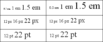
You'll note that the em values scale, but the pixels and points do not. The pixels should scaleand they do in browsers with correct font-sizing support. The points (which I advise you not to use for screen) remain the same size because they are absolute values, meaning they should never scale. As a result, many web designers advocate the use of ems over pixels. You'll note, however, the teeny text on the left. This can also cause serious problems if people have their browsers set to a smaller font size than medium.
Percentages
Percentage values in font sizing are always relative to another value, such as a keyword or length value. So, if I set my body font size to 1em and then set my H1 header to 150%, I'll end up with a larger h1 than the body font size, which is relative to the browser default:
body {font-size: 1em;}
h1 {font-size: 150%}
Percentages are particularly helpful in working around browser limitations in font sizing. The reason is that percentages are also scalable. As a result, many workarounds for the pixel problem in IE have been achieved by combining ems and percentages. Still, many designers prefer to go with pixels because of their more consistent rendering, at the cost of better accessibility.