Figure 2-43. Incorrect: there is nothing in the image that explains the angle of the shadow
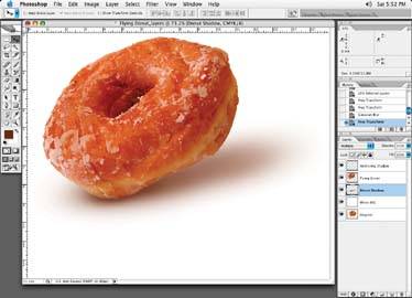
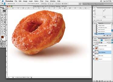
Figure 2-44. Correct: a shadow that stays on the horizontal, regardless of the object angle changes
Incorrect Shadow Angle
Always make sure a shadow stays put on the ground in a horizontal fashion, regardless of how the image angle may change. Notice that in Figure 2-43 there is no mountain or wall to explain the position of the donut's shadow. In Figure 2-44, the donut is hovering at an angle, but the shadow correctly "sits" horizontally on the ground. The only time the angle of a shadow would change is if the shadow hit an object that is on an angle, like a wall or mountain.
Figure 2-45. Incorrect: negative-looking shadow not on a multiplied layer
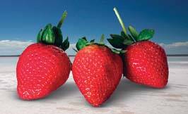
Figure 2-46. Correct: shadow on a multiplied layer
Not Putting the Shadow on a Multiplied Layer
Creating your shadows on a normal, unmultiplied layer makes the shadow appear to have a "negative" effect because the color of the shadow "knocks out" color beneath it. The shadow ironically ends up having less density than the rest of the image, as in Figure 2-45.
Figure 2-46 shows how the same shadow should look when multiplied correctly.
Figure 2-47. Incorrect: a shadow added to a colored area with less color than the object being shadowed
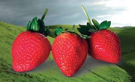
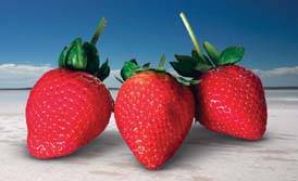
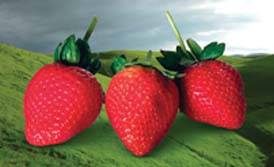
Figure 2-48. Correct: the proper look of the shadow with full color in it
Occasionally when creating shadows on a colored area, it may not make sense to have the shadow on a multiplied layer because too much color will then be added to the background area. In this case, just make sure that the color you brush in for your shadow contains at least as much color information as the background behind the shadow itself, or else it will have a negative look to it as well.
You can see this effect in Figure 2-47. For example, if I have a red strawberry and the red portion of the image is 100 magenta, 85 yellow, 30 cyan, and 10 black, make sure the color information in your shadow has those values, plus whatever extra color you add to create the darker shadow color. The only things you will have to keep in mind are the ink density specifications, which will be covered in a later tutorial.) For now, just make sure the color is there and the shadows look natural. Figure 2-48 shows our corrected example.
Incorrect Shadow Shapes
Poor shadow shapes are another common mistake. Make sure your shadow shapes properly relate to the shape of your object. If you are not sure what the shadow shape for an object may look like, if feasible, try and locate the object you are trying to create a shadow for in "real life," and have a good look at it. Or find a practical sized replica of the object that you can study. Place the object under a lamp and move it around to see how the shadow falls, or just take a walk outside and have a look at various shadow objects.
Figure 2-49. Incorrect: this shadow looks like a squished marshmallow with no gradation
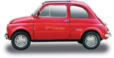
Figure 2-50. Incorrect: this shadow looks like someone painted a gray bar under the car
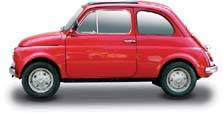
Figure 2-51. Incorrect: these shadows look like pads under the object
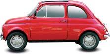
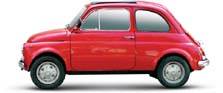
Figure 2-52. Our car with a realistic shadow
The next few figures show the same object, a car, with different types of shadows. Note in Figure 2-49, that the shadows under the car look like they were printed with a squished marshmallow; there is no gradation at all.
Figure 2-50, the shadow looks like someone just placed a gray bar under the car.
In Figure 2-51, the shadows under the tires look like pads placed under the car.
Finally, Figure 2-52 looks like shadows do in real life.