There are two typical scenarios you'll encounter when working with a color file: a client may ask you to take an image and spec it for use in a color ad in the newspaper, or you may be asked to convert the image to a grayscale image to be used in a black and white newspaper ad.
In either case, assuming I receive a color image to spec for newsprint, I always make sure I spec both a color image and a grayscale image for newsprint, regardless of what I was asked to do. I say this because there have been occasions when the client has asked to spec a supplied color image that will be changed to a grayscale image, only to come back at a later date to say that they now require a color newsprint image! It just makes your life a little easier if you have both on hand. Having a color image spec'd for newsprint also makes the conversion to grayscale a little easier.
Adjusting the Total Ink Values
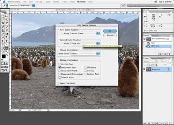
Let's assume you have a CMYK image. (If you have an RGB image, I'll discuss the transformation to CMYK shortly.) Start off by making sure the Information palette is open. Open the Information palette preferences, bringing up the dialog box shown in figure, and set the right side of the information box to display your total ink densities and the left side of the dialog box to display the Actual Color. The Info palette is customizable. Click on the little palette arrow on the top right of the palette dialog box and select Palette Options. You will be presented with the Info Palette Options box. Under First Color Readout, use the drop-down menu option and select Actual Color, which will display your actual color read-out on the left side of your Info dialog box. On the Second Color readout, set the Mode to Total Ink, which will display the total ink densities on the right side of the Info palette display. Say OK to the selections, and the Info palette will now display your new selected options.
Set up your Info palette to supply the necessary information
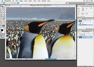
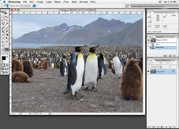
With the Eyedropper tool, look at the image in several areas and read the densities, as shown in figure. For newsprint, the maximum total ink densities for a color image in the darkest areas of your image should read around the 240 to 260 area, depending on the newspaper. The 240 or 260 values represent the total ink density when you add up all the CMYK values for a given area. For example, if the CMYK values for the darkest area of an image read Cyan 70, Magenta 60, Yellow 60, and Black 70, then the total ink density would be 260. For black and white images, the minimum dots will go from 3 to 90%
Our original image reads a total of 292: 75 cyan, 69 magenta, 65 yellow, and 85 black
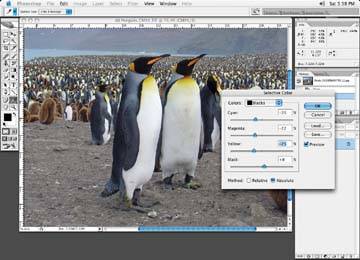
If the image reads less than 260, which is usually not the case, then we are through our first hurdle. If the image reads more than 260, there are a couple of ways to bring the image within the 240 to 260 range. The first option is to use your curves or the selective color correction tool and reduce the values in these dark areas. Open the Selective Color dialog box, shown in figure by choosing Image » Adjustments » Selective Color. Since the black areas of the image are the darkest areas, that's where we want to reduce the densities. Choose Blacks from the Colors drop-down box, and make adjustments to the sliders to get the readings in this case, a total ink density of 240.
I will make changes with either correction tool and take readings with the Eyedropper tool until I get the readings I am looking for.
If you started with an RGB image, this is where you would start with this example.
The second option to get your ink densities within specifications particularly if the image is very full overall and the ink densities vary in many different areas is to convert the image to RGB and then back to CMYK. Now, it's one thing to convert the image to RGB, but you have to have to have a good look at your color settings before any conversions take place this is very important. I have seen many inexperienced operators simply convert images by choosing RGB, and then go back to CMYK or to grayscale without any thought as to the settings. If you share a computer with other people, the settings may be totally inappropriate for newsprint use, or any use for that matter in fact if you haven't checked your settings lately, there's a pretty good chance they are not set up correctly at all!
Use the sliders to get the desired density
Choose the correct settings for newsprint in the Color Settings dialog box
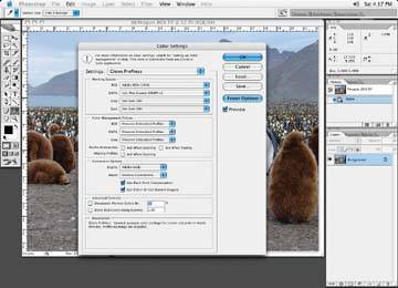
Let's look at my Color Settings dialog box and the settings I would suggest for newsprint. From the Photoshop menu bar, select Edit » Color Settings, and my Color Settings dialog box, as shown in figure, pops up.
Under the Working Spaces section of the Color Settings dialog box, select CMYK » Custom CMYK from the menu list. You are then presented with the Custom CMYK dialog box, as shown in Figure 8-11.
The Custom CMYK dialog box
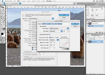
Start by giving your new color setting a descriptive name, like Newspaper 240. For Ink Colors, choose SWOP Newsprint. Dot gain can be left at the default setting of 30%. Separation type is set to GCR Medium. Set your black ink limit to 90% and the total ink limit to 240. UCA amount can be left at 0. Say OK to the changes, and you'll be presented with the Color Settings dialog box again. Give your new settings a name for easy recall the next time you need it.
Once the color settings are created and saved, convert your color image to an RGB image, if you haven't already. Once this is done, convert it to CMYK.
After the conversion process from RGB to CMYK, the darkest areas of the image will be no higher in ink density than the set limit of 240 as you set out in your custom CMYK color setting
Each time the image is converted from one color space to another, it will read the settings in your color settings and use values that have been set up. As you can imagine, the wrong settings could make a real mess of your image if not properly set up.
Let's take some readings with the Eyedropper tool of same dark area before and after the conversion with the new settings (set the tool to 3 by 3 pixels to get an average reading of an area).
As you can see, the image hasn't changed much in terms of its overall color because of the correct settings in the Color Settings dialog box. Because of the color settings, the ink densities in the darker areas have been reduced to newspaper specs. The cyan, yellow, and magenta have been reduced and replaced with more black. This now brings the image ink densities in line with newspaper specifications.