-
The effect is not always perfect. There can be a lot of fine-tuning and fiddling to get the image to look right.
-
I have found that the Vanishing Point tool can be a little slow, especially if you are not on the fastest computer around; seems a little unfair, eh?
-
When using the Stamp tool, it appears to be blotchy in the way it laid down the color. I find single clicks work best.
-
Some alignment problems occur if you have to change your brush alignment like I had to do to fill a corner.
-
The image must be RGB. This may or may not be a big deal for you.
-
When using the Vanishing Point tool, I found that some of the perspective was off, in spite of the fact that some areas looked bang on.
-
Adding areas to an image once you deviate or start a new selection from the original Stamp selection or Marquee selection makes it difficult to get the right alignment.
-
Using the Marquee tool to add to the image area is a faster way to add image than the Stamp tool.
Try different methods, and keep an open mind as to what serves you best. I suspect that the Vanishing Point tool is best suited to objects where alignment with other elements in the image is not critical. For instance, if you were to place an image on the side of a building or vinyl siding on a building, I could see it working well. Again, there are many ways to do the same thing when retouching, and you have to decide what is best for you.
Another request I often get is to create highlights and add shape to an object. There can be many reasons for this. The client loves the shot, but it requires some fixing up to make it more dramatic. There may be wine glasses that require a sparkly sheen to them or a piece of metal or paint requires a shiny look. Care must be taken though, as there are different types of sheen to objects. A very shiny, smooth surface will have a hard, bright shine to it, but an object with a flat, dull finish, like a brushed metal surface, should have a flatter sheen to it.
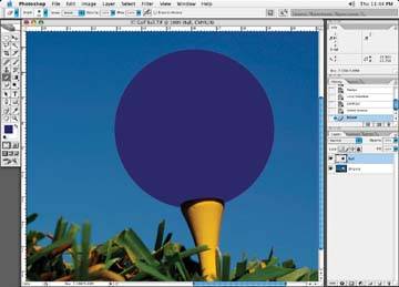
Let's take a round circle of color, as in Figure 4-62. I just created the circle part of the image in Photoshop by filling a circle selection with color.
Figure 4-62. Before: adding a basic circle of color in Photoshop
Once you have the object identified, create a new layer in your file, call it Highlights, and set the layer to normal (default). Create another new layer, set the attributes to multiply and call it Shadows. There are a couple of different highlights and shadows we could draw on this ball to achieve two completely different looks. One could be flat looking, as if the ball were sprayed with a flat paint. Another look could be that of a very shiny ball where the highlights and shadows appear very hard with little diffusion. In Figure 4-63, I've created a ball with a flat look to it, and in Figure 4-64, I've created a very shiny ball. Let's go through the steps to see how each was made.
Figure 4-63. After: the flat spray paint technique
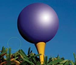
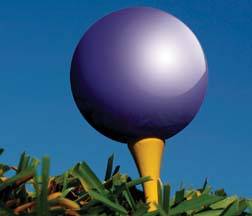
Figure 4-64. After: the high-gloss technique