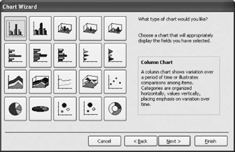
Selecting a chart type in the Chart Wizard
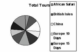
A pie chart that plots tours.
You already know what a chart ischarts illustrate data, relationships, or trends graphically. Like the saying "a picture is worth a thousand words," charts are often better at presenting information than hard-to-read numbers in a datasheet. Microsoft Access comes with a great built-in program for creating charts called Microsoft Graph. You can insert charts and graphs on forms and reports, and this lesson will show you how.
-
In the Database window, click the Reports icon in the Objects bar and click the New button.
The New Report dialog box appears.
-
Select from the list, select qryCustomerTours from the drop-down list, and click OK.
The first screen of the Chart Wizard appears. Here you have to tell the Wizard which fields you want to display on the chart.
-
Double-click the TourName field in the Available Fields list.
The TourName field appears in the "Fields for Chart" list.
-
Click Next.
The Chart Wizard asks what type of chart you want to use to display your data, as shown in figure. Table shows the more common charts and gives an explanation on how and when they are used.
-
Select the Pie Chart and click Next.
Next the Chart Wizard asks how you want to lay out the data in your chart. You do this by dragging and dropping the data fields to the appropriate areas on the chart. Since we chose a simple pie chart, everything is already correctly laid out for us.
-
Click Next.
You can specify a chart title if you're not thrilled with Microsoft Access's imaginative suggestions. You can also specify whether or not you want to include a legend with your chart.
-
Click in the What title would you like for your chart? box and type
Total Tours. Click Finish to create the pie chart.Access creates the pie chart, as shown in figure.
The Microsoft Graph program seems to have some bugs, so the legend of your chart may be missing some items.
-
Exit Microsoft Access without saving any changes.
Types of Charts and Graphs
| Chart or Graph Type | Description |
|---|---|
|
|
Column charts are used when you want to compare different values vertically side by side. Each value is represented in the chart by a vertical bar. If there are several values in an item, each value is represented by a different color. |
|
|
Bar charts are just like , except they display information in horizontal bars rather than vertical columns. |
|
|
Line charts are used to illustrate trends. Each value is plotted as a point on the chart and is connected to other values by a line. Multiple items are plotted using different lines. |
|
|
Area charts are the same as , except the area beneath the line is filled with color. |
|
|
Pie charts are useful for showing values as a percentage of a whole. The values for each item are represented by different colors. |
|
|
Scatter charts are used to plot clusters of values using single points. Multiple items can be plotted by using different colored points or different point symbols. |
|
|
Combination charts combine two different types of charts together (for example, a combination chart might contain both a column chart and a line chart). |
TO INSERT A CHART INTO A REPORT:
-
DISPLAY THE REPORT IN DESIGN VIEW.
-
SELECT INSERT » CHART FROM THE MENU, AND THEN DRAG AND DROP A CHART ONTO THE REPORT, WHICH OPENS THE CHART WIZARD.
-
SELECT THE TABLE OR QUERY YOU WANT TO CHART FROM THE LIST, AND CLICK NEXT TO CONTINUE.
-
DOUBLE-CLICK EACH FIELD YOU WANT TO ADD TO THE CHART AND CLICK NEXT TO CONTINUE.
-
CLICK THE CHART TYPE YOU WANT AND CLICK NEXT TO CONTINUE.
-
MAKE ANY LAYOUT MODIFICATIONS TO THE CHART AND CLICK NEXT TO CONTINUE.
-
ENTER A CHART NAME AND CLICK FINISH.