You can really punch up the text on your page by playing around with font, size, italics, and text color. FrontPage dubs these selections "character formatting" options, because the program applies these changes character by character. But the fact is you can make any amount of textbe it a single character, a word, a sentence, or even multiple paragraphsitalicized, extra-large, pink, and so on.
The instructions that follow tell you how to use FrontPage's basic text-formatting features. You do need to understand these options and how to use them in order to get the most out of FrontPage. However, Cascading Style Sheets (CSS) are a much more efficient and effective way to format your Web pages. You'll read all about CSS in Cascading Style Sheets.
Fonts
Using different fonts can do a lot to make your pages more appealing. You can use them to distinguish headings from text and to complement your content in subtle but meaningful ways. The list of fonts that come with FrontPage is long and varied. Maybe you've already taken a peek and are excited to use Papyrus font in your page on Egyptian crop yields. Are you sure you want to use that font? Yes, you say, you've thought out the design and think that your visitors will have no trouble deciphering the font. Fine, but what about their browsers? If a visitor doesn't have that Papyrus font loaded on his system, the browser will substitute another font, and suddenly your clever design idea looks terrible.
The best way to avoid unexpected results is to stick to the following basic fonts: Arial, Arial Black, Courier New, Comic Sans, Georgia, Impact, Times New Roman, Trebuchet, Verdana, Symbol, Webdings, and Wingdings. If you want to use type that's easy to read on a computer screen, try Georgia, Trebuchet, or Verdana. These three were created specifically for the Web.
If you must use an unusual font for some reason, try incorporating it within a graphic. For example, type your special font text and take a screenshot (Ctrl+PrtSc). Then you can paste the shot into a graphic-editing program, crop it, and save it as an image file. You should use this tactic only for short text snippets, of course. (See Adding Pictures to learn all about working with images in FrontPage.)
Applying a font is simple. First, select some text or place your cursor where you want to begin typing in your new font. Next, select a font from the Font drop-down list on the Formatting toolbar, or select Format » Font to open the Font dialog box, pictured in Figure 2-4.

Figure 2-4. The Font dialog box provides a preview pane and additional font effects on the bottom. Turn on an effect to preview its appearance within the dialog box. Some effects work only with browsers that support CSS. These include: Overline, Small caps, Capitalize, and Hidden.
Don't blink! Actually, go ahead, but not all browsers support blinking text. Don't worry. The consequences won't be serious. If a browser doesn't support an animated effect, it just ignores it.
Font Size
Just as site visitors may not have all your fonts on their systems, they also might set their browser to display fonts much larger or smaller than you intended. There's not much you can do about this, except design your page intelligently so that elements like headings, paragraphs, and menus are laid out in proportion to one another. When you do, even if a visitor sees everything at twice the size, she can still find her way around your site.
The font size list in Figure 2-4 contains two measurements for each selection. If you're an experienced word processor, you may be familiar with the point size measurement (12 pt, 14 pt, and so on). A point is equivalent to 1/72 of an inch. That's a very specific figure, but it won't be much help to a browser, which, as you've learned, doesn't necessarily display anything at a fixed size.
That's where the HTML font measurement comes in. The adjacent numbers within your font list (1, 2, 3, and so on) are "virtual" HTML font measurements. FrontPage's standard size for normal text is 3 (12 pt). Font sizes 1 through 7 are measured in terms relative to this standard size. Each increment represents a 20 percent difference. Therefore, size 2 is 20 percent smaller than 3, and size 4 is 20 percent larger. This is how HTML really measures fonts. In fact, FrontPage shows corresponding point measurements only to guide Web authors who are used to working with word processing programs. While font size 3 may look 12 point on your system, on another browser set to view large fonts, it might look more like 16 point.
If you want to see the difference, try changing the text size setting on your own browser. Open a Web page and select View » Text Size. Depending on what browser you're using, options on the sub-menu will differ, but they'll let you increase or decrease the text size.
You can change text size using the Font dialog box or the font size drop-down list on the Formatting toolbar. FrontPage also gives you a shortcut. Look down the Formatting toolbar to the right, and you'll see two buttons: Increase Font Size and Decrease Font Size. Use these buttons to increase or decrease the size of selected text by 20 percent each time you click them.
Text Color
Have you ever visited a Web page and found it illegible because the text color is hard to see against the background color? Text placed over a picture can cause similar problems. Put some thought into the colors you choose for your background and text. (You'll learn about setting your Web page's background color on Adding A Background Picture.) For best results, make you text contrast highly with the background. If you have really long passages of text, help your readers out by using dark text on a light backgrounda combo that makes for the easiest reading.
To set a text color, select some text and click the arrow to the right of the Color button on the Formatting toolbar. A small dialog box of standard colors displays (see Figure 2-5).
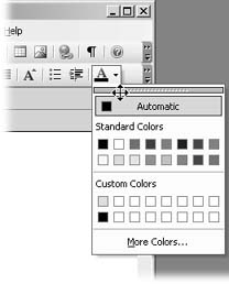
Figure 2-5. If you're applying many colors, you can keep this dialog box active. Place your cursor over the bar at the top until it turns into a four-headed arrow, shown here. Then drag it off the toolbar.
You can select one of the standard colors that appear in the dialog box or click the More Colors option to display more choices (see Figure 2-6).
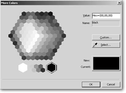
Figure 2-6. Most of the choices under More Colors are Web-safe colors. This means that site visitors will definitely have these colors on their systems, and you can be certain that the page will look just as you want it to. You can click on any color, or, if you're Web savvy, feel free to enter the hexadecimal value in the box in the upper-right corner.
If you want to customize your colors even further, click the Custom button within the More Colors dialog box. But customize with caution. Unless you're absolutely sure that all your site visitors will have your exact operating system and browser (as in a corporate intranet, for example), it's a really bad idea to customize here. Any custom colors you create won't necessarily be Web safe. Web-safe colors are any of the 216 colors that exist on all computer systems. If a visitor doesn't have a color loaded on his system, the browser might substitute another color. Substitution with an unplanned color can result in dire consequences, like your text fading illegibly into a page's background color.
Colors on the Web
Web-safe colors include six shades of red, six shades of green, and six shades of blue. Possible combinations of these hues add up to 216 Web-safe colors. These 216 colors make up what is called the Web Palette and render accurately on both Mac and Windows systems. In other words, all your visitors are sure to have these colors, and you can use them without worry.
HTML communicates color information by using hexadecimal values. A hex value is an alphanumeric string of six figures based on the shades of red, green, and blue available within the Web Palette. The first pair of characters designates the shade of red, the second pair indicates the shade of green, and the third indicates the shade of blue. There are 16 possible values for each figure in a pair: 0, 1, 2, 3, 4, 5, 6, 7, 8, 9, A, B, C, D, E, and F. For example, the hex value for fuchsia is: #FF00FF. The # sign indicates the start of a hexadecimal value.
Some hex values have corresponding names that are also recognized in HTML. Select one of these colors within the More Colors dialog box, and its name displays beneath its hex value in the upper-right corner. While FrontPage saves you the trouble of having to know and type in hex values, it's good to know what they are.
Since FrontPage is a program for making Web pages, you might think that the pretty hexagon in the More Colors dialog box would feature all 216 Web-safe colors, but it doesn't. If that's not frustrating enough, it turns out that a few of the colors in this dialog box aren't even Web safe. Not very helpful.
So how do you know if a color you've chosen is Web safe? Just look at the hexadecimal value listed in the upper-right corner of the More Colors dialog box. Hex values consist of three pairs of characters. If any pair is not 00, 33, 66, 99, CC, or FF, that means that the color isn't Web safe, as illustrated in Figure 2-7.
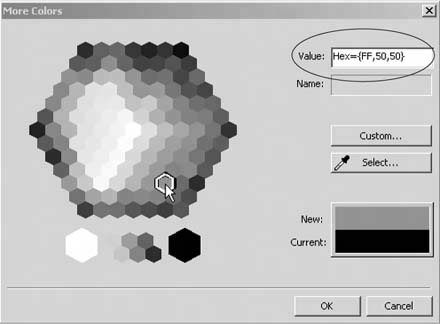
Figure 2-7. The hex value for this color indicates that it's not Web safe. Two pairs within the hex value (50 and 50) deviate from the Web-safe formula outlined above. Thankfully, this color is an exception. Click on most of these colors, and you'll find that they're Web safe.
Match Colors to a Graphic
If you've added a graphic to a page (see Adding Pictures), you might want to color coordinate your page by matching the text color you're using to a color in the picture. Trying to make this match using the color selection tools you just learned about is pretty hard. You try one color and it's too dark. Then the next is too light. Fortunately, FrontPage gives you a handy tool that can take any color from a graphic and add it to your color palette:
-
With your FrontPage Web page open, click the color button on the formatting bar and select More Colors.
-
Within the More Colors dialog box, click Select.
Your cursor changes into an eyedropper. As it passes over different colors within the graphic, each displays in the New section of the More Colors dialog box, and its hex value appears above.
-
Click whatever color you want to use as your text color and then click OK.
The color you've chosen is now an active choice for text. Don't forget to check the hex value, if you want to make sure your new color is Web safe.
You can actually use your dropper to select any color that appears on your screen. Take the eye-dropper for a spin around your desktop and see for yourself.