Once the minimum dot has been established, we must look at what that minimum dot will gain on press. For instance, if a 3% dot grows to 5% or more, then you have some decisions to make. A 3% dot in the ice cream may look OK now, but if it grows or gains to 5% or more, as will all colors with a minimum dot, will it then look too full?
One way to determine the final look is to create a simulation gain curve based on the dot gain curve information you got from the printer. Use this curve on the image you are working on to simulate what the press may do to your image as a visual cue. You can see the effects by comparing the images in Figure 9-6 and Figure 9-7. (Of course, do not save the image with this curve, as it is used purely as a visual check.
Figure 9-6. The original image viewed without a gain curve
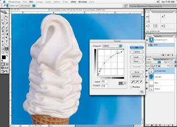
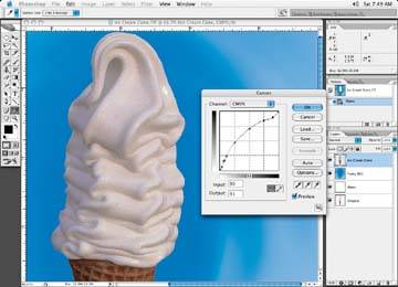
Figure 9-7. The image viewed with a gain curve
Another great option is to get a profile of the press on which the job will be running. This may or may not be an option because it may be very difficult to get the information needed to build such a profile from the printer, especially if they are overseas as mentioned earlier. If you can get a profile, you are in luck. You can then use this profile in Photoshop. You can use View Proof » Setup Custom (as we did for the newspaper profile in Tutorial 8). Once the profile is loaded in this way, you can hit Command+Y to toggle between your original image and the simulated press output. Nice to have if you can get you hands on the profile.
You may find that when all the dots gain, the look of the image is unacceptable and appears far too full, which you can see in Figure 9-7 is in fact true in the case of this ice cream image.
Using a proof setup is an effective technique for any output device you may be printing to. Whenever you can, try and get your hands on the profile for the device to which you will be printing.
What can we do to fix this? All the colors make the ice cream too full when the press gain is factored in. The first thing to do is reduce or take out some of the other colors. Obviously, if you take out one of the CMY channels, you will get an unwanted color cast, assuming that the ice cream is supposed to be plain old vanilla! You could make the ice cream out of the black channel only and delete all the other channels out of the ice cream portion, leaving the rest of the process colors in the rest of the image.
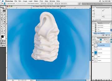
Do this by going in and physically make crop masks of each area (if it hasn't been done already) of the image that needs to have its color adjusted. It can be a rather tedious process, but a necessary one. Once you have your masks made, create a layer for each part of the image you will change. In this case, start with the ice cream and go from there. Figure 9-8 is our image with the ice cream on a layer.
Figure 9-8. Isolate the ice cream on a layer
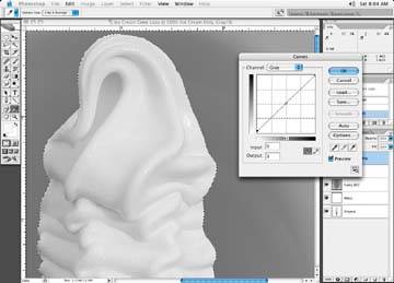
First, look through the color channels and see if any of the channels have any decent shape that will look good if used on its own. If not, duplicate the image and create a black and white of the image with the Image » Mode » Grayscale function. (See Figure 9-9.)
Let's look at the newly created black and white image and take readings of the ice cream in various areas to see if we have a minimum dot that the specifications ask for. (I may use my dot gain curve or profile to look at the image as well to make sure it looks acceptable as I make subtle changes.)
If you need to bump up the highlight area to increase the minimum dot value required (Figure 9-10), use the curve adjustment and move the zero point until you get the minimum dot reading. If the midtone area of the image looks to full, adjust that as well with the curves and bring it down. You will probably have to go back and forth a few times between corrections and the Photoshop dot gain curve until you get the look you are after. Obviously, some experimentation will be necessary.
Figure 9-9. Duplicate the image and create a black and white copy
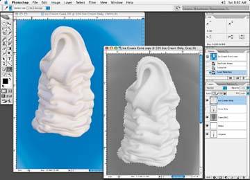
Figure 9-10. The highlight dot observed in the black and white image
Once you have the look you're after with the grayscale image, copy the ice cream portion and paste it into the black channel of the four-color image, as in Figure 9-11. Then go through the remaining channelsthe C, M, and Yand delete any information in them so you're left with a black-only ice cream.
Figure 9-11. Copy the ice cream only and paste it into the black channel of the four-color image
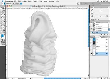
Figure 9-12. The final look of the new black-only ice cream, ready to be copied and pasted to the black channel of the full-color image
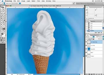
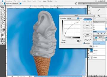
Figure 9-13. The same image with the gain curve added to see how the final printing will affect the image
Now paste the ice cream into the full-color image in the black channel, and delete all other color channel information in the ice cream area, as shown in Figure 9-12.
Then we can apply the curve to see the simulated results, shown in Figure 9-13.
You can use the same process for each area of the image. You must go through the image systematically and repeat this process for each element. You have to decide if having all color channels in a particular area of the image is good or bad for the image.
As I mentioned before, you have two choices when you adjust an image for flexo printing. Either keep a color channel in the image, make sure that the minimum dot for that color is there, and accept the look when the color gains on press, or delete the color entirely and make it work with one or more of the channels. Clients tend to find this situation rather hard to accept, but its the way it is.
Figure 9-14. The ice cream pasted into the yellow channel, and the gain curve applied to show how the final printing will look
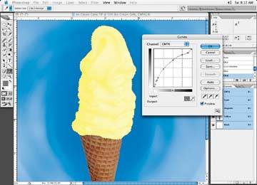
Figure 9-15. Here it is in the magenta channel: not bad if we want strawberry ice cream!
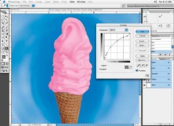
Figure 9-16. In the cyan channel: again, not bad if we want to have blueberry!
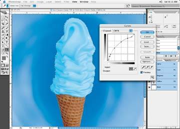
Here are some variations of pasting the ice cream into the other color channels and applying the gain curve to see how the final print will look. For instance, Figures 9-14, 9-15 through 9-16 show the various effects of pasting the ice cream into the yellow, magenta, or cyan channels, respectively, and then applying the curve to see how it will look.
Unfortunately, it doesn't appear to be working out all that well with the process colors for the light-colored vanilla ice cream we are looking for. Let's explore other options.