Color schemes are an integral part of programming. In Visual Basic, you can assign colors to your interface elements easily enough by using control properties. You can set controls to different colors depending on the options the user selects. You can use colors to convey information to the user, and to make your application exciting and interesting.
Now remember those awful color combinations. You can't be sure everyone will enjoy the colors you've chosen for your application. What's more, some of the color schemes you see weren't set because people wanted to look at something pleasing to the eye, they were set so the user could clearly see everything on the screen. An example of such a color combination would be the High Contrast color combination. This setting is available both from the Display Properties and from Accessibility Options, both available from the Control Panel. See the section "High contrast" later in this chapter for further information on this setting.
Color blindness and other visual impairments affect a lot of people in many different ways. You can't accurately guess what color combination every computer user is going to be able to see on the screen. But you can design your application to allow each user to set his or her own colors, avoiding the problem altogether. You can do this by setting the colors in your application based on the system settings the user defined on the Display Properties property sheet. Visual Basic includes a set of constants that represent system colors, such as vbWindowBackground and vbTitleBarText. We'll be using some of these constants in our color sample applications.
Background patterns
Sometimes it's nice to have an image or a pattern in the background of an application, an image of your company logo, for instance. While this can look nice and seem unobtrusive, a background image can cause a lot of problems for your users. It makes the screen busy, so people with cognitive disabilities can have difficulties focusing on the actual information provided on the screen. Background images can also cause difficulties for users who are color blind, and even those with low vision, because text and labels often end up on top of a busy background. As an example, let's look at the FullColor sample, shown in Figure 16-5.
The background image in this case is a picture of Half Dome at Yosemite National Park. It's very pretty and is relevant to the topic of hiking addressed by the application. However, if you're not in high color mode the first thing you'll notice is that this picture is quite ugly. If you are in high color mode and can see all the colors of the picture, you'll notice that the screen is very busy, too busy for some users. The best solution to this problem is to provide the user with a means of turning off the background image. The ColorOpt sample gives the user an Options menu with a Background menu item that allows the user to turn the background image on and off. This is done with a call such as the following:
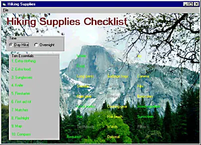
Figure 16-5 FullColor sample showing a detailed background image
  Const IDB_BACKGROUND As Long = 101
  .
  .
  .
  Private Sub ChangeBackground(ByVal bRemove As Boolean)
      If Not bRemove Then             ' Turn the background off
          Set frmHiking.Picture = LoadPicture()
          frmHiking.BackColor = vbWindowBackground
      Else                            ' Turn the background on
          Set frmHiking.Picture = LoadResPicture(IDB_BACKGROUND, vbResBitmap)
      End If
  End Sub
Notice the BackColor setting. The vbWindowBackground constant designates the Windows system setting for a window background. By using this constant the application displays the window background color set by the user in his or her Display options. You can find all the color constants in Visual Basic's online Help under Reference/Language Reference/Constants/Core Language Constants/Color Constants.
Color coding
The FullColor sample has been designed to give the user a choice between day hiking and overnight hiking and to suggest equipment that should be carried on the selected hike. A simple way to do this is to color code the options. To make the options visible on the picture background, I chose a green color (&HFF00&) from my system palette at design time as the Required color, and a yellow color (&HFFFF&) as the Optional color.
NOTE
Colors are identified by hexadecimal values that represent the intensity of the component colors red, green, and blue. The component values range in intensity from 00 (lowest) to FF (highest). For example, the hexadecimal value for pure green is FF00, or 00FF00-00 for red, FF for green, and 00 for blue. Likewise, pure red would be defined as FF0000.
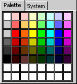
When you set your colors at design time, you can use the Properties window to set the foreground and background colors for controls and forms using the drop-down palette shown here:
If you select a color from the palette, you'll be selecting from your current system palette, as I did. If you're running in high color, you could be choosing colors that someone running in 256-color or 16-color mode doesn't have. Windows will do its best to substitute, but often the results aren't what you'd like. For now, though, we have a nice application with a pretty background that conveys the information we need. Unless, of course, the user can't read it. The green and yellow I've chosen might be invisible or indistinguishable to someone who is colorblind. These colors might also not be visible to a user who has turned the background picture off, depending on what their default window background color is.
The first solution to using the green and yellow colors is to use system colors, as we did with the window background. For the ColorOpt sample I've set the Required color to vbHighlight and the Optional color to vbWindowText. However, even these colors aren't enough to distinguish the different options. You should never rely on color alone to convey information. Our final solution is in the ColorOpt2 sample, shown here:
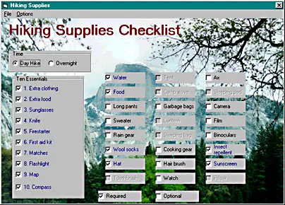
In this sample we're still using the colors to differentiate the options, but we've changed from labels to check boxes. Now the Required options have check marks next to them as another way to convey the information to the user. Another solution, which you'll see only if you have a screen reader device connected to your machine, is the changing of the check box captions depending on the option selected. If the user has a screen reader connected to his or her machine, you want to turn off the background image and give a non-graphical indication of the options. So in addition to the check boxes, if the ColorOpt2 sample detects a screen reader device it will add text to each caption indicating whether the option is required. See the section "Screen readers" later in this chapter for information on determining whether a screen reader device is present.