Figure 13-1. Three-column layout with fixed flanks and fluid center column.
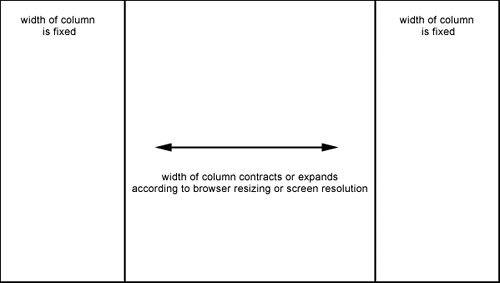
Creating this layout involves using absolute positioning to position the left and right columns. You then give these explicit widths in pixels (that's how they become fixed). The trick here is to leave a width out of the center column so that it remains fluid and expands or contracts according to available space (see Example 13-1).
Example 13-1. Three-column layout with fixed flanks and fluid center
<style type="text/css">
#nav {position: absolute; left: 10px; top: 50px; width: 200px;}
#content {margin-left: 200px; margin-right: 200px; margin-top: 10px;}
#sidebar {position: absolute; right: 10px; top: 10px; width: 200px;}
</style>
You'll notice that the #content div has left and right margins. The numeric value of these should be adjusted to accommodate any padding or borders you add to the columns themselves. The top margin is there just for visual balance, and you'll see that there's no width whatsoever. Figure 13-2 shows a page laid out using this technique with additional styles for the text, whitespace, and imagery. Figure 13-3 shows the same page resized, so you can see how the content will flow into the available space.
Figure 13-2. Fixed flanking columns with a fluid center column.
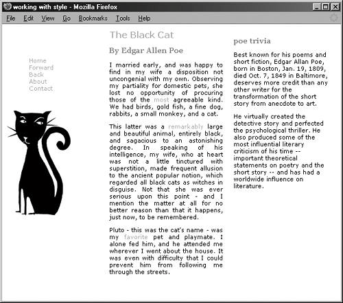
Figure 13-3. Here you see how the text will reflow upon browser resizing.

If you want to fix the center column, you can do so by adding an explicit width. However, on browser resize, columns will overlap.
The templates are available at www.phptr.com/title/0131855867.