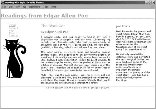
Figure 13-4. A sophisticated three-column layout with a masthead and a footer.

This layout uses floats, not positioning, to achieve the desired results (see Example 13-2).
Example 13-2. Using floats for layout
<style type="text/css">
#masthead {width: 768px;}
#nav {float: left; width: 200px;}
#content {float: left; width: 368px;}
#sidebar {float: left; width: 200px;}
#footer {width: 768px; clear: both;}
</style>
This is a fixed-width layout, which means that none of the columns will dynamically change width-wise. Notice how the columns are simply all floated to the left, placing them one after another along the horizon. You'll also note that the #footer div uses the clear property with a value of both. This ensures that the footer completely clears the floated columns (see Figure 13-5).
Figure 13-5. A three-column, fixed layout with a masthead and a footer.

You can make a fluid version of this layout simply by using percentages instead of fixed widths (see Example 13-3).
Example 13-3. Using percentages to create a fluid version
<style type="text/css">
#masthead {width: 100%;}
#nav {float: left; width: 20%;}
#content {float: left; width: 60%;}
#sidebar {float: left; width: 20%;}
#footer {width: 100%; clear: both;}
</style>
"Containing Floats" is an excellent article on working with floats from CSS expert Eric Meyer; see http://www.complexspiral.com/publications/containing-floats/.