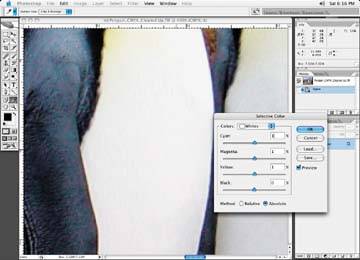
Use the Eyedropper tool, with a sample size of 3 by 3, along with the information box to take readings of these two areas. In a white area, you should get something like a 4% cyan, 3% magenta, and 3% yellow. An exception to this minimum dot would be in areas that are called spectral highlights, such as a glimmering diamond or a wine glass with a bright flare or star burst coming from it; a dot isn't necessary in these cases.
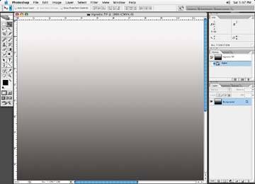
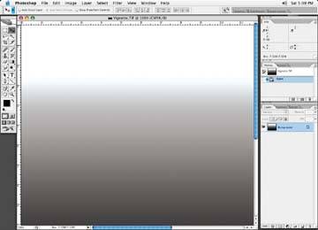
Be careful when adjusting a minimum dot area: check the image thoroughly to make sure you haven't reduced a highlight area to the point at which a vignette or an area with a gradation breaks off abruptly. Following figure shows the way you want it to look; the next figure shows a highlight that has been reduced too much.
The way a smooth area should look
A gradated area breaking off because of a highlight that has been reduced too much
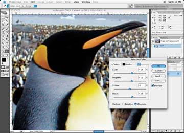
As for the shadow areas, adjust the values to something like 60% cyan, 50% magenta, 40% yellow, and 90% black, as in Figure 8-20. That will give you a total ink density of 240. You'll notice that the yellow is down by 10% from the magenta (typically on a quality coated stock, to achieve a neutral tone, the yellow and magenta values will be the same you need to reduce the yellow further for newsprint to compensate for the yellow look of the newsprint paper. The highlight are should be set to a neutral balance.
Adjusting the shadow area with the Selective color correction tool to obtain a neutral balance
Adjusting the highlight area with the Selective Color correction tool to obtain a neutral balance