One very important specification to look at and obtain is the dot gain curve that will occur during the printing process; this is crucial to producing a good-looking final image. The look of the image can change drastically when printed because of the way the press prints; this is reflected in the dot gain curve, like the one in Figure 9-3, which is a typical example of dot gain curve guide that you might receive from a carton printer.
Figure 9-3. Dot gain curve from a carton printer
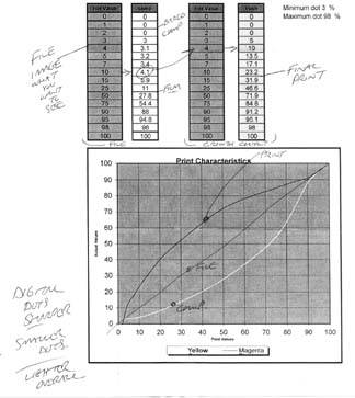
Some explanation of the dot gain curve is necessary. You'll see that there are four columns with numbers in them. Let's start with the column that is second from the right. This column represents the dot percentage values that exist in the image file that is ready to be printed.
The column on the far right represents the dot percentage values after your image has been printed on the press. As you can see, if your original image had a 1 or 2% dot in it, these dot values would drop off and not print on the press.
Notice how a 10% dot gains to over a 23% dot! Unlike newsprint or newspaper images, which of course gain too, the gains that are typical on carton and packaging printing are not all that consistent, and the gains are quite heavy. Some are even worse than the example in Figure 9-3! This is one of the better ones!
So you can see that you have a quite a challenge in front of you to produce a good-looking image that will print well on press.
There are a few ways to help you see what you'll get on press prior to going to press so that you can adjust your images accordingly.
One method is to use a proofing system to simulate press conditions. The first column on the far left represents the original image file values. The second column from the left is the same file after having been scooped. What I mean by scooped is that the image is basically taken back with a curve in the opposite direction in which it gains. The image is taken back in this manner so that when the press gains, (the far-right column) the image is basically brought back to the way it was originally, which is desirable.
This is typical of a workflow for a flexo press and a packaging proofing workflow. Images are prepared in such a manner that they are flexo press ready, as will be discussed shortly. The images are then placed in a Quark or Illustrator file, and then the entire file is scooped by special packaging software in the hope that the file will gain back that information and produce a proof or printed piece that basically looks like your original file. This is the hope.
Unfortunately, many of the presses that typically print packaging work are not state-of-the-art machines. Much carton work is now printed overseas, and many of the presses are old and not all that consistent. It isn't always the case, but something to keep in mind.
At the bottom of Figure 9-3 is a visual curve representation of the gain curve. The straight line in the middle of the curve running from the bottom left to the top right of the curve represents your original image, or the image you have corrected in Photoshop. The curve to the bottom of the straight line is the scooping of the image that would occur after the file has been assembled as a final file, and the line above the image line is the gain incurred during the printing process.
A little later in this tutorial, I'll explain how to make a curve in Photoshop with the Curve adjustment tool that will mimic the press gain you can expect from the printing press. You won't ever apply the curve to an image, but you can use it as you go along to see how your corrections are reflected in the final image.
Figure 9-4. A CMYK image ready for corrections for packaging
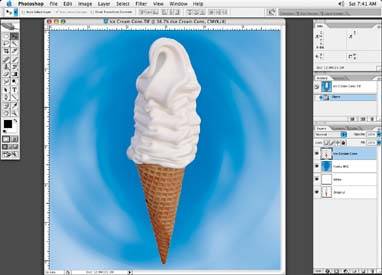
Back to the image at hand, shown in Figure 9-4, which shows the image to be used on a package in Photoshopwe have a print specification sheet from our printer and the dot gain curve.