6. A typical request is to take transactional data and produce a summary by model for product line managers. You can use a pivot table to get 90% of this report, and then a little formatting to finish it.
The key to producing this data quickly is to use a pivot table. Although pivot tables are incredible for summarizing data, they are quirky and their presentation is downright ugly. The final result is rarely formatted in a manner that is acceptable to line managers. There is not a good way to insert page breaks between each product in the pivot table.
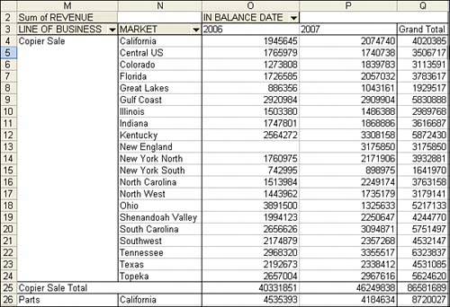
To create this report, start with a pivot table that has Line of Business and Market as row fields, In Balance Date grouped by year as a column field, and Sum of Revenue as the data field. Figure 7 shows the default pivot table created with these settings.
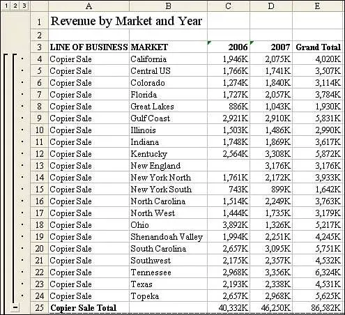
7. Use the power of the pivot table to get the summarized data, but then use your own common sense in formatting the report.
Here are just a few of the annoyances that most pivot tables present in their default state:
-
The Outline view is horrible. In Figure 7, the value "Copier Sale" appears in the product column only once and is followed by 20 blank cells. This is the worst feature of pivot tables, and there is absolutely no way to correct it. Although humans can understand that this entire section is for product copier sales, it is radically confusing if your Copier section spills to a second or third page. Page 2 starts without any indication that the report is for copier sales. If you intend to repurpose the data, you need the Copier Sales value to be on every row.
-
The report contains blank cells instead of zeroes. In Figure 7, customer New England had no copier sales in 2006. Excel produces a pivot table where cell O13 is blank instead of zero. This is simply bad form. Excel experts rely on being able to "ride the range," using the End and arrow keys. Blank cells ruin this ability.
-
The title is boring. Most people would agree that "Sum of Revenue" is an annoying title.
-
Some captions are extraneous. The words "In Balance Date" floating in cell O2 of Figure 7 really does not belong in a report.
-
The default alphabetical sort order is rarely useful. Product line managers are going to want the top markets at the top of the list. It would be helpful to have the report sorted in descending order by revenue.
-
The borders are ugly. Excel draws in a myriad of borders that really make the report look awful.
-
The default number format is General. It would be better to set this up as data with commas to serve as thousands of separators, or perhaps even data in thousands or millions.
-
Pivot tables offer no intelligent page break logic. If you want to be able to produce one report for each line of business manager, there is no fast method for indicating that each product should be on a new page.
-
Because of the page break problem, you may find it is easier to do away with the pivot table's subtotal rows and have the Subtotal method add subtotal rows with page breaks. You need a way to turn off the pivot table subtotal rows offered for Line of Business in Figure 7. These show up automatically whenever you have two or more row fields. If you would happen to have four row fields, you would want to turn off the automatic subtotals for the three outermost row fields.
Even with all these problems in default pivot tables, they are still the way to go. Each complaint can be overcome, either by using special settings within the pivot table or by entering a few lines of code after the pivot table is created and then copied to a regular dataset.