Excel doesn't provide this feature directly, but by hacking an XY scatter chart you can create a very effective variable width column chart. XY scatter charts are used to compare values; therefore, they provide a perfect base on which to start creating a variable width column chart.
The figure shows a variable width column chart that charts the percent share versus cost for the following expenses: gas, electricity, water, food, travel, and other. The X axis (the axis along the bottom of the chart) shows the percentages (%), while the Y axis (the axis on the lefthand side) shows the cost ($).
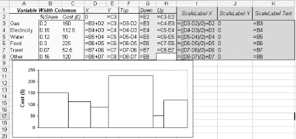
Figure. XY scatter chart set up from range D2:E8

To create this chart, set up some data such as that in the and, using the Chart Wizard, highlight the range D2:E8. Then, in Step 1 of the Chart Wizard, select the XY Scatter Chart option. Accept the default scatter chart, which shows only points, and click Next to move to Step 2 of the Wizard. Ensure that Columns is selected. Click the Next button to move to Step 3 of the Wizard, and under Value (Y) Axis, type Cost ($). Click the Next button and ensure that the chart will be produced as an object, not on a new sheet. Click Finish to see the scatter chart.
You can use Ctrl-~ (which is the same on the Mac) to show you the correct formulas to place in the cells. You also could select Tools » Options... » View (Views under Excel » Preferences on Mac OS X) and check Formulas under Window options.
Now it's time to play around with the chart to create columns. First remove the legend and gridlines (highlight them, then click Delete) and format the plot area to no fill by clicking the gray background, right-clicking, and selecting Format Plot Area. Under Area, select None.
Highlight the X axis, then double-click it to get to the Format Axis dialog. Click Scale. Under Value Axis Scale, set the Minimum to 0 and the Maximum to 1. Click the Patterns tab and set the Major Tick Mark type to None and the Tick Mark Labels to None, then click OK. The scatter chart will look something like that shown in the figure.
Figure. Modified scatter chart

The next step is to create the lines for the columns, so double-click the data points to bring up the Format Data Series dialog. Click the X Error Bars tab. In the Display section, select Minus, then select Custom - Range and highlight the range F2:F8. This produces the horizontal line at the top of the column.
Now click the Y Error Bars tab and select Both under Display. Set the Custom + Range to H2:H7 and the Custom - Range to G2:G8, then click OK. This will give you the vertical sides of the columns.
Now that all the hard work is done, it's time to tidy up a bit and add some labels. First, under the Format Data Series dialog, select Patterns and then select None under Marker. The results are shown in the figure.
Figure. XY scatter chart manipulated to produce variable width column chart
If you want to use labels, you need to download John Walkenbach's Chart Tools, available from http://j-walk.com/ss/excel/files/charttools.htm. Part of this add-in is designed specifically for data labels. It enables you to specify a worksheet range for the data labels for a chart series. (Unfortunately, it doesn't seem to work on Excel for the Macintosh, even after extraction from its EXE distribution.)
Before you use Chart Tools, you must add a new data series to provide X-axis labels for the chart. So, highlight the chart, right-click, and select Source Data and then Series. Select Add to add a new series. Under X Values, highlight the range I3:I8, and under Y Values, highlight the range J3:J8. Format the new data series so that it has no marker by going to the Format Data Series dialog, selecting Patterns, and then, under Marker, selecting None.
Now it's time to use an add-in. Make sure you have Series 2 selected, and then select Chart » JWalk Chart Tools. When the dialog box pops up, make the data label range K3:K8.
To add yet another new data series to provide column labels for the chart, highlight the chart, right-click, select Source Data, and then select Series. Select Add to add a new series. Under X Values, highlight the range I3:I8, and under Y Values, highlight the range C3:C8. Again, format the new data series to have no marker by selecting Pattern, then Marker, then None in the Format Data Series dialog.
Again, use your add-in. This time highlight Series 3 and link the data labels to A3:A8. The result will look like that shown in the figure.
Figure. Completed variable width column chart
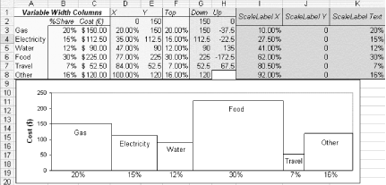
The fantastic thing about this type of chart is that the bars will either expand or contract up the Y axis and along the X axis when the entries in the % Share or the Cost ($) columns change. Pretty nifty.